
Holy Crunch!
brand identity + packaging
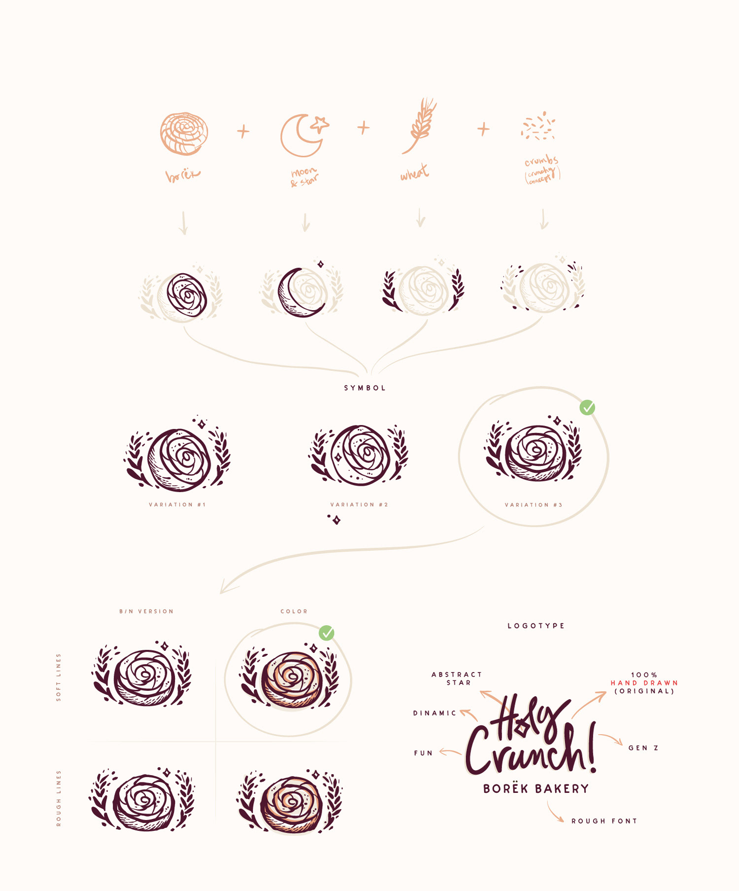
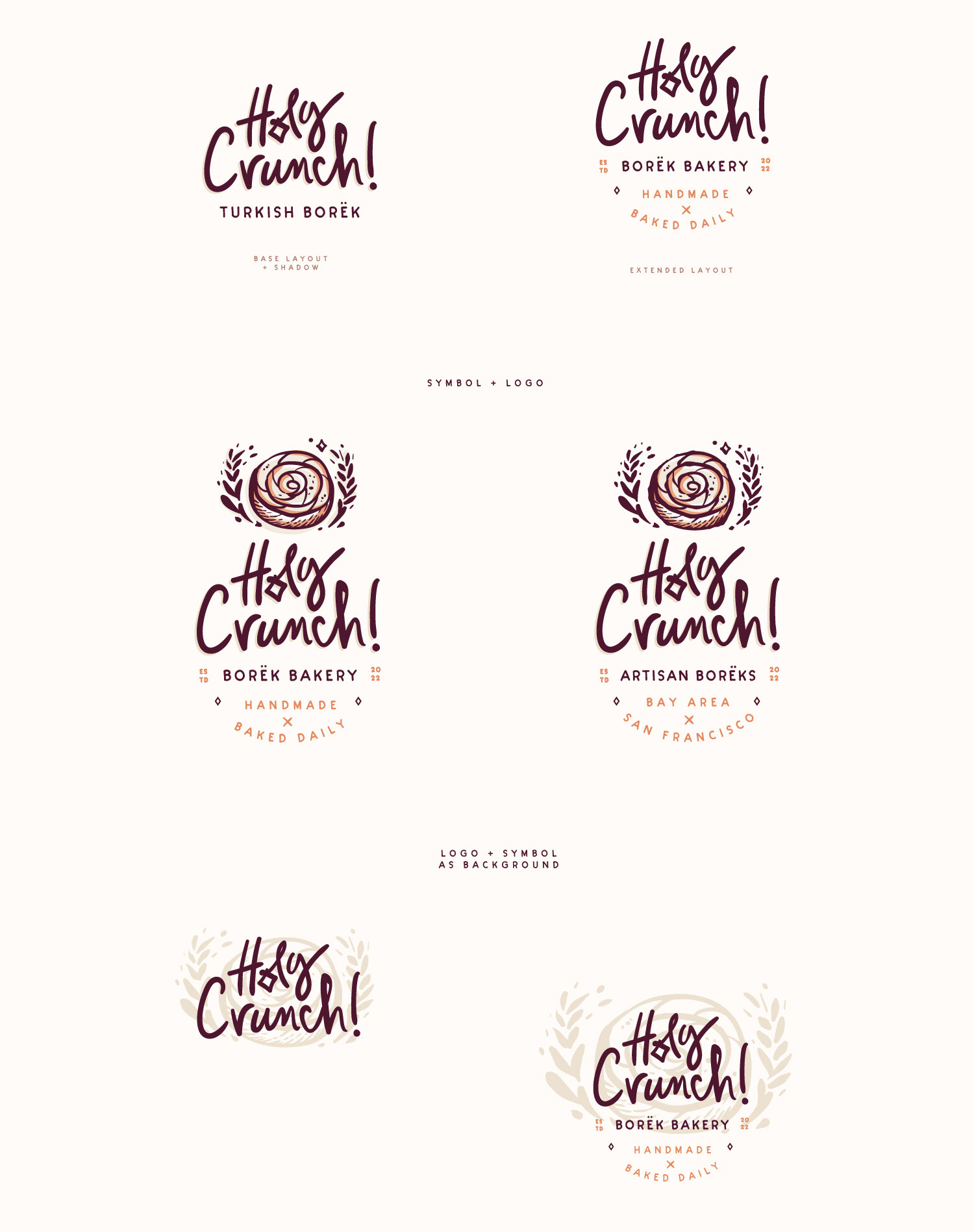
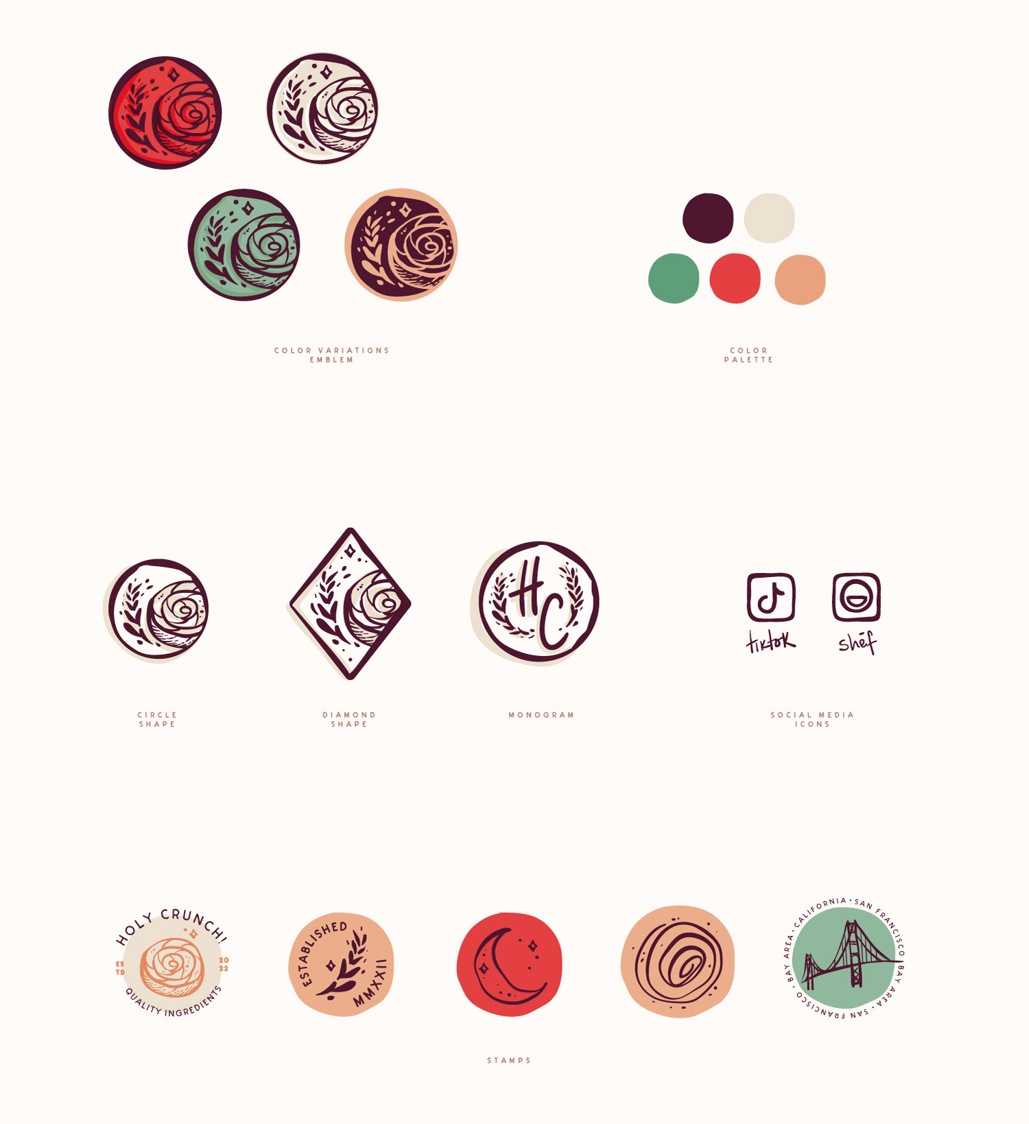
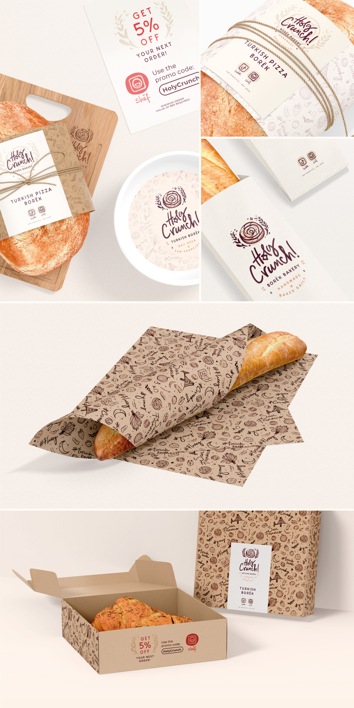
Holy Crunch is a California-based Turkish bakery. Its young owner requested a 100% hand-drawn typography. The symbol should represent the heart of the business: Börek, but with a modern and fun twist, appealing to a Gen Z target.